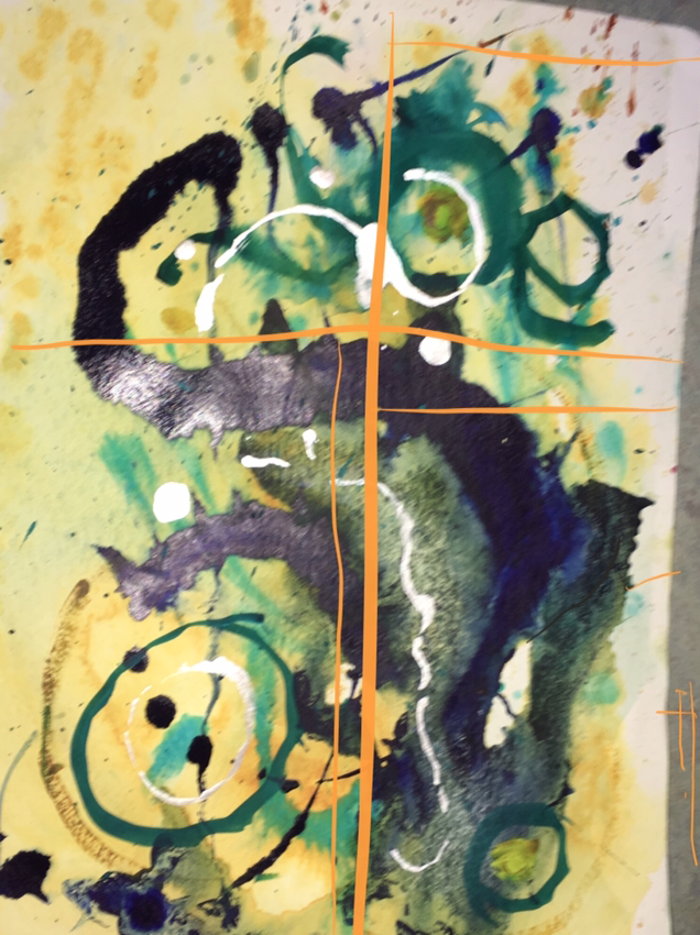
This is a quartersheet watercolor, taken into Paper53 to add the orange. I can’t decide if I want to add the orange in real paint. Any observations are welcome. I think this painting has something to do with the heat and humidity here in Florida where I live. The colors here and the stretching blue skies are whelming, maybe overwhelming at first. It rains every afternoon lately so we get all kinds of sky shows.
Thanks, as always. Martha Keim (-used-to-be-St.-Louis)

It is beautiful even, smooth ….. better leave it like that. ….. But if you want to represent the Florida climate I cross that you can add in each corner a different color from those 4 blue. green. yellow. Brown. (The circle of the seasons)
LikeLiked by 1 person
There’s a nice dynamic with the orange but I’m not sure about opacity I try something more fugitive and less definite,
LikeLike
I agree. Tried again with cobalt violet and watercolor. Orange is the one
LikeLike